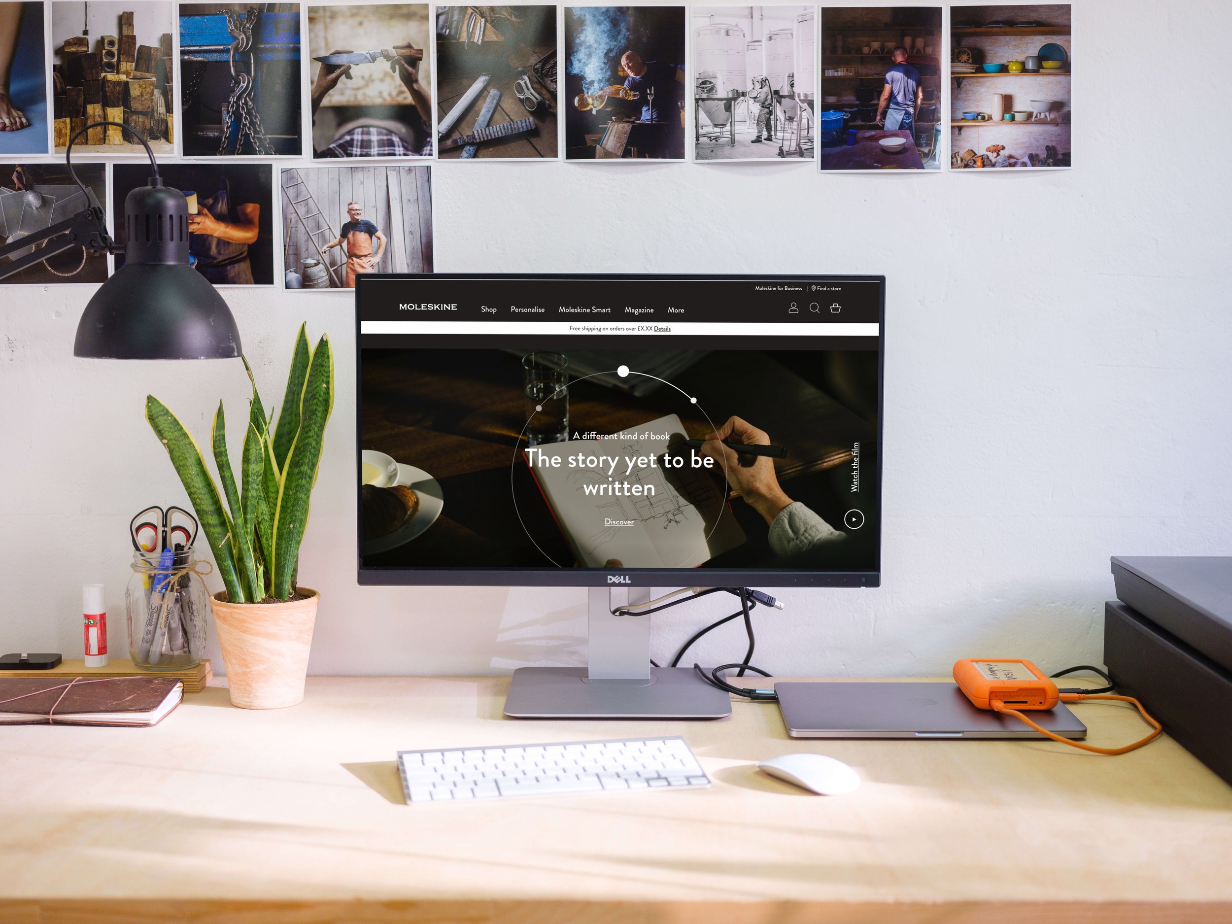
Moleskine: E-commerce Website Redesign
Responsive e-commerce website transformation in two phases to reintroduce the brand during the pandemic

Overview
End-to-end design of a mobile-first, responsive website encompassing two phases covering a research phase and Agile sprints to create a customer-centric e-commerce experience, elevating functional e-commerce, into an experience that embodies the products and the craftsmanship behind a Moleskine product.
Team consisting of Project Managers, Strategy, UX and UI designers and a separate build company including myself as one of two UX designers on both the Solution Phase and Design Phase.
The result of Phase One: Solution was key stakeholder buy-in from the client, development of a tested, proof of concept prototype and approval to move into a full website redesign.
The result of Phase Two: Design was the release of the full e-commerce responsive website resulting in:
25% improvement in product page views;
13% improvement in add-to-basket rates;
10% improvement on sessions that transact,
13.6% increase of an average order value increase
DMA Bronze Best UX Award
all within the first 6 months of the website going live.
The Opportunity
Moleskine is a world leading premium stationery brand founded from an idea by Maria Sebregondi to bring back the iconic notebooks of Bruce Chatwin and Ernest Hemingway.
By 2000, within 3 years of founding, Moleskine sales were €20 million, firmly establishing them as the notebook brand of choice for creatives and professionals alike.
Twenty years later, Moleskine is competing in an increasingly digital world, with a digital solution unable to capitalise on an increase in pandemic-driven online purchases.
Moleskine, like many other companies in 2020, had not been able to keep their stores open across the world in 2020.
Simultaneously, a new CEO had been brought in to revolutionise and refresh the brand’s presence, especially in an increasingly digital world.
These two occurrences drove Moleskine to seek to strengthen their digital offering in their key markets of the USA and Europe where interest in craftsmanship is strong; and to look to increase their presence in Asia, especially in Japan and China.
Moleskine’s website did not perform well with users, with high bounce rates and low conversion rates.
Documents and Immersion
This project was unique from the outset because usually, we work as sole UX Architects with a Visual Designer when necessary. However, Moleskine’s tight timelines and timings of other projects meant that there were two UX Architects with two Visual Designers added in the later stages of the solution phase.
I was scheduled to start the project in conjunction with another senior UX Architect with our time split leading different pieces of research, but two urgent, short projects came in back to back that I had to lead.
This meant that I worked on later parts of the Solution phase, while my colleague covered the earlier parts so we could work on other clients.
We began the project by reading through the range of documents and assets sent to us by Moleskine. There was a deluge of information, which we had to sift through. However, key insights, like Google Analytics did not provide as much information as we had expected.
My colleague held interview and immersion sessions with the stakeholders at Moleskine and project partners to understand the business needs.
Heuristic Analysis, Pen Portraits and a Pain Points Workshop
I set up a Heuristic Analysis to benchmark their website. I offered several competitor sets for Moleskine to choose from, with a mix of premium stationery and other premium, best-in-class e-commerce sites.
In the end, I performed a heuristic analysis to benchmark Moleskine.com against four competitor sites: Montblanc, Apple, LeCreuset and Away. Moleskine.com fell consistently short, coming last overall.
The client had assured us that they had UX personas, but this was not so. Instead, using the research we conducted, we fleshed out the six brand personas Moleskine provided us into attitudinal Pen Portraits.
We then held a Pain Points workshop to validate these with the clients where I moderated a session with the CEO, the US Head of E-Commerce and members of the product team.
Challenges and Experience Vision
Using our analysis, pen portraits and stakeholder workshops, we identified seven key challenges and formulated seven Experience Recommendations. Some of the key challenges identified were:
How do we create navigation that reflects our products and serves our users?
How do we integrate the Foundation, FOLD and MyMoleskine into the e-commerce experience?
How do we offer personalisation?
Seamless checkout is a hygiene factor. How do we build relationships?
Our Experience Recommendations for these key challenges were:
Taxonomy and navigation that always puts wayfinding first
Any editorial content on Moleskine.com must serve user needs, goals and motivations on Moleskine.com
Personalisation is part of the journey by default
Offer accelerated checkout, find another way to build relationships
We successfully presented the seven Experience Recommendations to the key stakeholders and ensured alignment that would allow us to begin the proof of concept with an agreed rationale.
Proof of Concept
The homepage needed to address the issue of wayfinding so, in consultation with the strategist, I formulated a solution that would allow us to serve multiple Moleskine paths. This included:
Hero product featured prominently on the homepage, not hidden in the navigation
Discovery of exciting digital options as an alternative to a notebook
Assistive gifting as a way to draw people to purchase on Moleskine, not Amazon
In addition, the Moleskine site had some personalisation available, but it was not meaningful and seemed to be an afterthought on the site. The recommendations included:
Personalisation that is more obvious on the product detail page
More options to customise the notebook
I set about creating a set of wireframes to enable us to build a proof of concept prototype showing how this solution could reposition Moleskine’s online presence.
“I'd want to see it again... make sure that everything is there. Just check it, then check it again.”
-Boston, USA Participant
Usability Testing Preparation
I handed off the wireframes to a visual designer while I put together a testing plan and recruited users across the globe to test the proof of concept prototype.
The day before testing was due to begin, the prototype was presented to the key stakeholders. We had kept in close contact with the client during design but were still dealt with a last-minute hiccup. The CEO felt that there was not enough of the story of Moleskine on landing on the homepage.
The visual designer and I quickly scrambled to create a solution that would balance the e-commerce needs against brand awareness. We ultimately put together an animated carousel on landing that would showcase the product first and then introduce elements of the Moleskine story and its Foundation.
I only received confirmation to go ahead with testing an hour before my first session.
Usability Testing and Insights
I tested with 7 participants recruited globally from APAC, EMEA and the USA:
3 in APAC
1 in Japan
2 in Shanghai
1 in EMEA
1 in Germany
3 in the USA
1 in New York / Ohio
2 in Boston
In testing, the prototype was generally well-received by all participants:
Participants found the site overall to be easy to use
Participants found the design to be mostly consistent with their understanding of who Moleskine are
6 out of 7 gave it 8 or above out of 10
7 out of 7 said they would use the site specifically based on the ability to personalise
There were a few key areas that needed improvement:
For some, the personalisation offering would be the only reason they would go on the brand site, but it was not clear early in the journey that it was available.
The subscription offering intrigued participants but was buried amongst other details.
Checkout was well received but with slight variations in expectations in the process based on market norms:
APAC was used to expedited checkouts
Some users in the USA expected to confirm and check personalisations several times during checkout.
These insights and the proof of concept were presented back to the client, who was aligned with our work and commissioned the start of Stage Two: the full website design.
Sprints
Once stage two was approved, a backlog and roadmap of Agile sprints were set up. Over the course of several backlog reviews it became clear that there was almost twelve months worth of work, while the deadline set for the new website to be launched could not be moved. Even with a prioritised backlog and the de-prioritisation of a subscription feature, it was clear that we would need more designers. So, in an unusual twist, the agile sprints eventually had three UX designers and three UI designers working to meet the three month deadline.
My main focus was creating the checkout experience, the personalisation experience and the global navigation including the menu for both web and mobile.
I iterated mid and high fidelity wireframes and prototypes to create a crafted checkout experience worth of the brand, allowing for multiple payments methods, guest checkout and a smoother logged in experience that reduced the need for repeat data entry.
The personalisation page was given a narrative and weaved in the wonderful story via video of the special process Moleskine used to personalise items while reducing the choice paralysis common when deciding what and how to personalise.
The global navigation and menu ensured that a key issue of wayfinding was improved so the Moleskine catalogue was fully discoverable.
Commercial Outcomes
The completion of phase two, the design phase, led to the successful relaunch of the global Moleskine website in the summer of 2021.
The fully responsive e-commerce website was released globally across all markets, re-introducing Moleskine as a leader in customer-centric, brand-aligned e-commerce experiences.
Within the first six months, the website saw marked improvements in e-commerce industry benchmarks including:
25% improvement in product page views;
13% improvement in add-to-basket rates;
10% improvement on sessions that transact,
13.6% increase in the average order value.
The website also went on to win a DMA Bronze Best UX Award at the end of 2021.


